Velora Engagement Engine
An audience tool built by engineers, for engineers—redesigned for the marketers who actually use it.
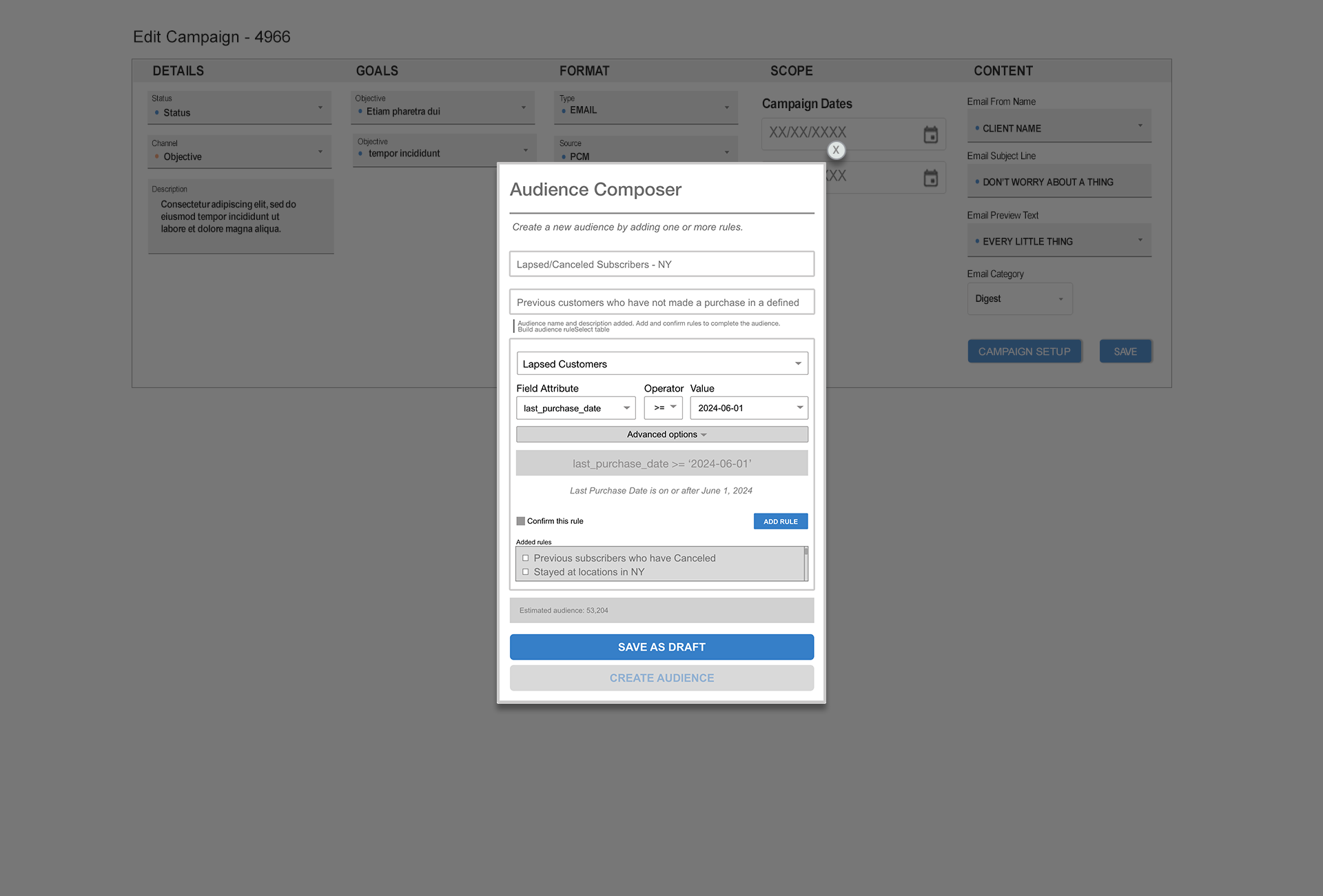
The redesigned Audience Composer—a focused, plain-language rule-building flow.
Interface has been recreated and renamed to protect client confidentiality.
Project Information
- Category :UX Design / Internal Tools
- Platform :API-driven ECRM System
- Role :UX, UI, Front-end
- Status :Concept & Ongoing Iteration
- Tools :Figma, Adobe XD, HTML, CSS, JavaScript, AI-Assisted Prototyping
- Confidentiality :Recreated and renamed; not the original interface
Snapshot
Who it served: Non-technical marketers building audience segments for email campaigns in an internal platform tied to an enterprise CRM.
The problem: The audience builder was built by engineers, for engineers—raw query syntax, no plain-language meaning, and no safe way to undo a mistake. Marketers avoided it, copied old audiences, and screenshotted everything before saving.
What I changed: Translated rules into plain English, added confirmation and safe rule removal, and hid advanced controls behind a clean default.
What it would solve: Faster audience setup, fewer costly errors, and marketers building with confidence instead of workarounds.
Findings
Less-technical users avoided building from scratch.
Rather than learn the underlying query logic, they copied an existing audience and adjusted it to fit.
Experienced operators still needed safeguards.
Even users familiar with the tool benefited from clearer labels, rule previews, and confirmation steps because small setup errors could affect campaign targeting.
"I have no idea what a filter_query_object is. I just copy what someone else did and hope it works." — Marketing coordinator, regular platform user
"I've broken audiences before by clicking the wrong thing. Now I screenshot everything before I save." — Marketing ops team member
Before moving into wireframes, I mapped the recurring usability questions that came out of discovery:
How can users verify what a rule means?
Should advanced options be hidden by default?
How can the interface reduce accidental changes before an audience is created?
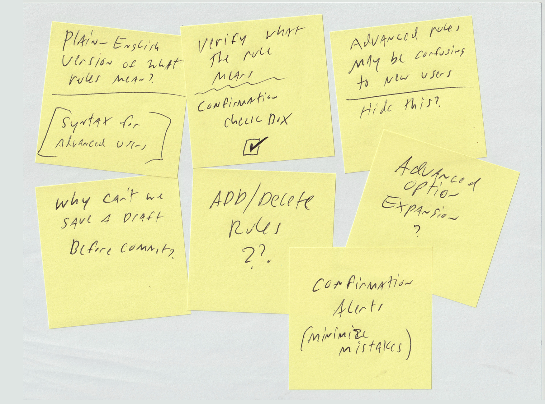
Affinity mapping from discovery sessions
Key Design Decisions
Rather than a feature list, here are three decisions that defined the redesign — each with the problem it solved and the tradeoff considered.
Decision 1 — Plain-English Rule Translation
- Problem: Users saw raw API syntax like
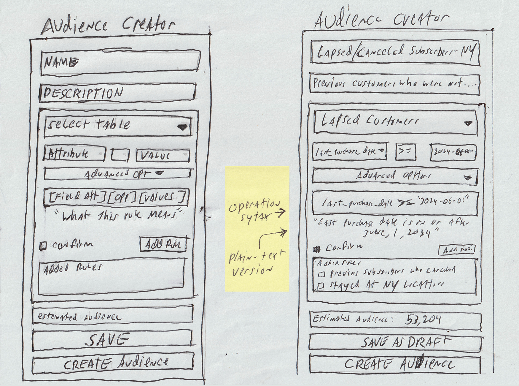
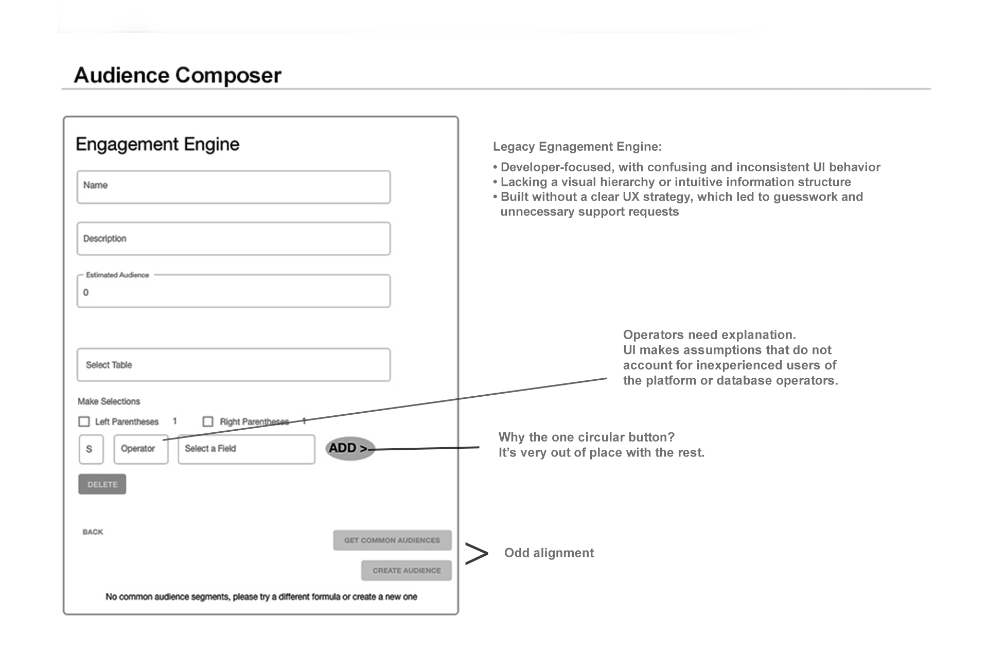
(last_purchase_date >= '2024-06-01')and couldn't tell what their rule actually meant. - Decision: Every rule shows a plain-language translation alongside the syntax—"Last Purchase Date is on or after June 1, 2024"—so users could read what they were building in language they understood.
- Tradeoff: Accurate translation means mapping every operator and field to a readable string—a non-trivial engineering investment, so I scoped phase one to the most common operators.
Decision 2 — Confirmation Gate + Destructive Action Safety
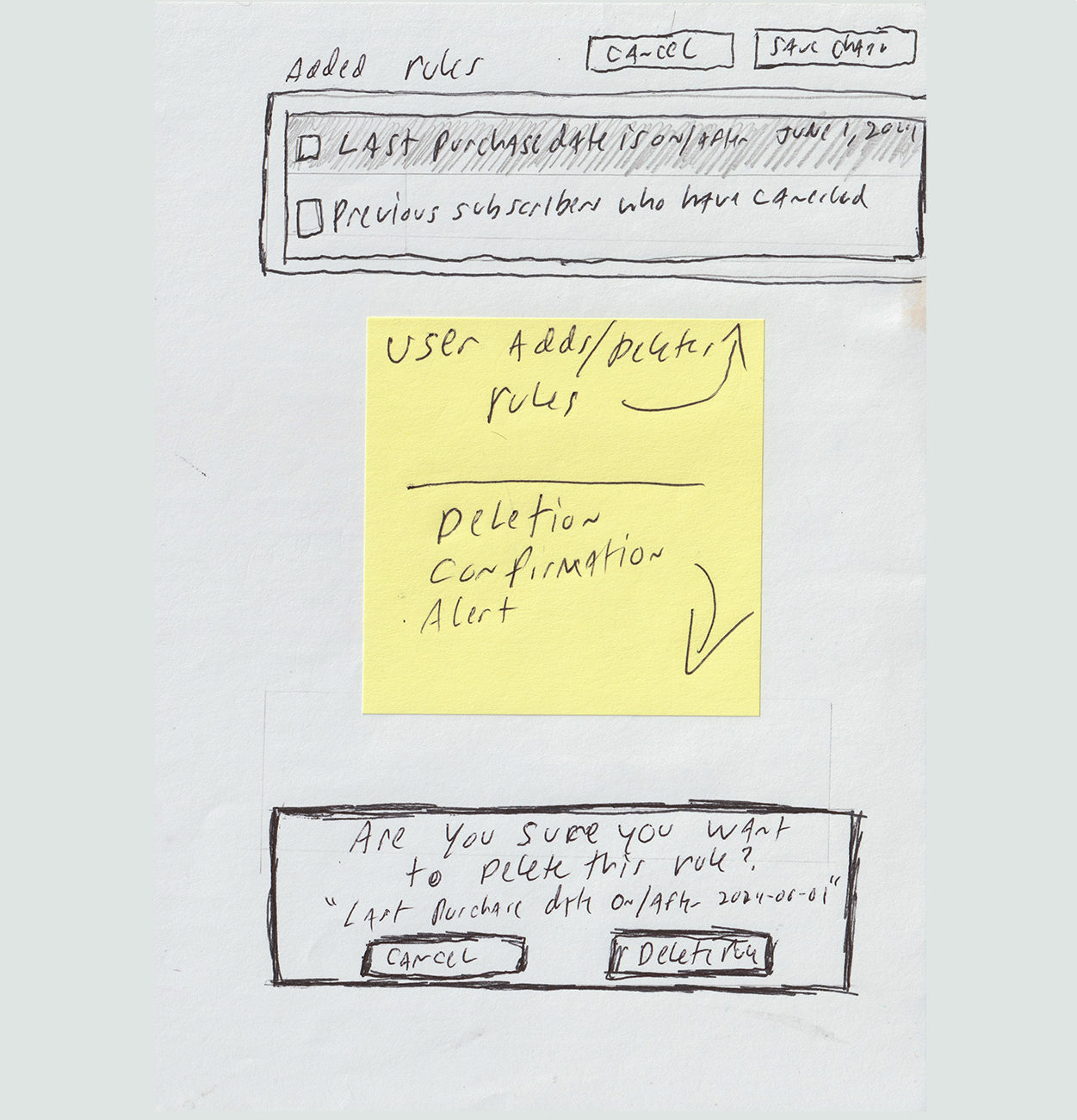
- Problem: The original tool gave users no safe way to fix a mistake—a wrong rule couldn't be edited or cleanly removed, so a single error meant rebuilding the audience from scratch. Users' own defense was screenshotting every configuration before saving.
- Decision: I added a "Confirm this rule" step before a rule commits, inline editing that loads a saved rule back into the builder, and a delete-confirmation modal that names the exact rule before removing it—so a single mistake became a quick fix instead of a full restart.
- Tradeoff: These safeguards add steps to the flow. Accepted—the seconds they cost are trivial next to what users were doing instead: rebuilding an entire audience after one wrong click.
Decision 3 — Progressive Disclosure for Advanced Options
- Problem: Parentheses grouping controls were always visible, adding noise and confusion for the majority of users who never needed them.
- Decision: Collapsed advanced options behind a toggle, hidden by default. Power users can expand them; everyone else gets a clean default.
- Tradeoff: I considered keeping them visible with clearer labels instead, but rejected it—the problem wasn't that the controls were confusing, it was that they were irrelevant to most users. Better labels don't fix irrelevance; removing them from the default view does.
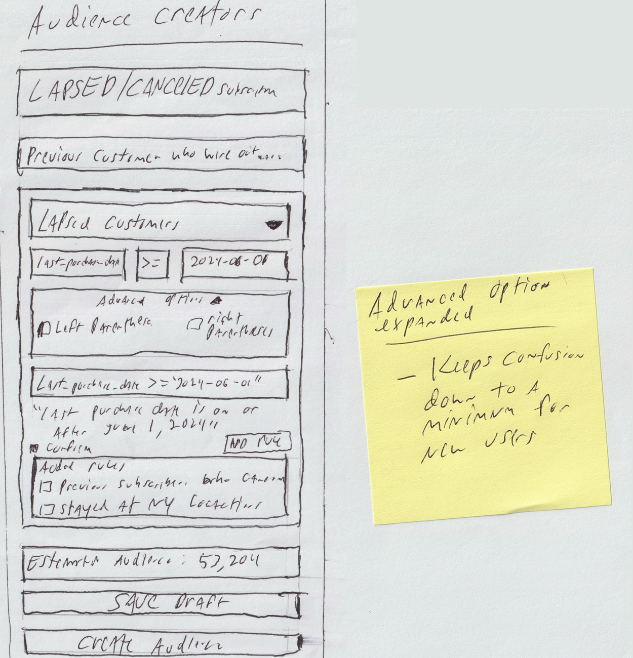
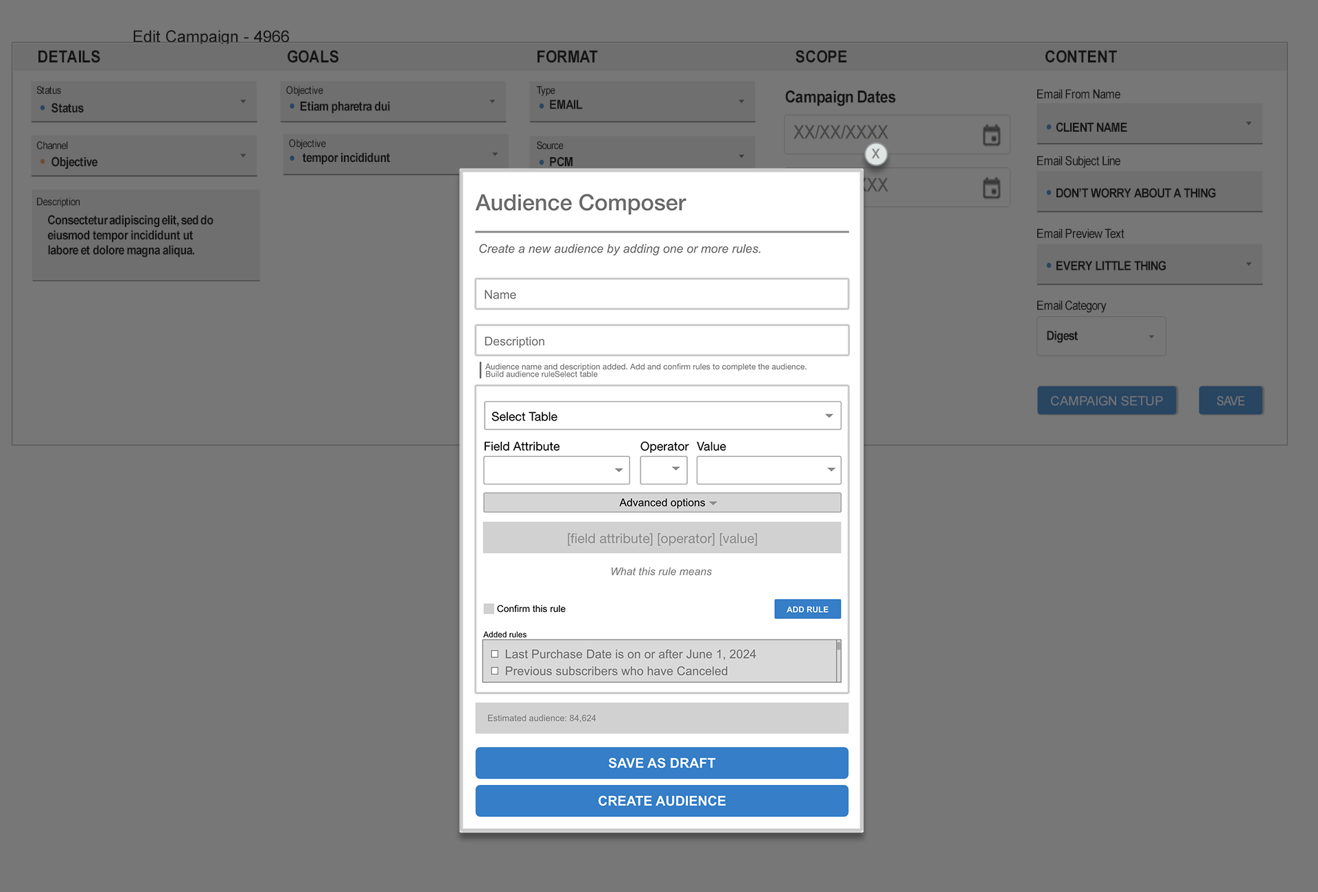
Before / After
The same task—defining an audience—before and after the redesign.
From Wireframes to Working MVP
To make the redesigned workflow tangible—something a marketer could actually click through—I built a front-end MVP of the Audience Composer in HTML, CSS, and vanilla JavaScript. It doesn't connect to a live CRM or database; the goal was to demonstrate how the flow would guide someone through building an audience with fewer opportunities for error.
The prototype intentionally covers only the core workflow—from naming an audience through defining, confirming, editing, and creating rules—so the experience stays focused on the task. Non-essential product areas were left out.
I also added progressive validation and guidance, including helper prompts and disabled states, so the user understands why certain actions are unavailable. For example, the Create Audience button remains inactive until the audience has a name, description, and at least one confirmed rule.
AI-Assisted Prototype
I used AI to help convert my wireframes and interaction notes into a front-end MVP. The design direction, workflow, validation rules, and UX decisions were mine; AI helped accelerate the HTML, CSS, and JavaScript implementation so the concept could be experienced as a working prototype.
Interactive Prototype
Explore the working MVP version of the redesigned Audience Creator flow.
Launch Interactive PrototypeDesign Flow
The redesigned Audience Creator walks users through a structured sequence — from empty state to confirmed audience — with feedback at every step.
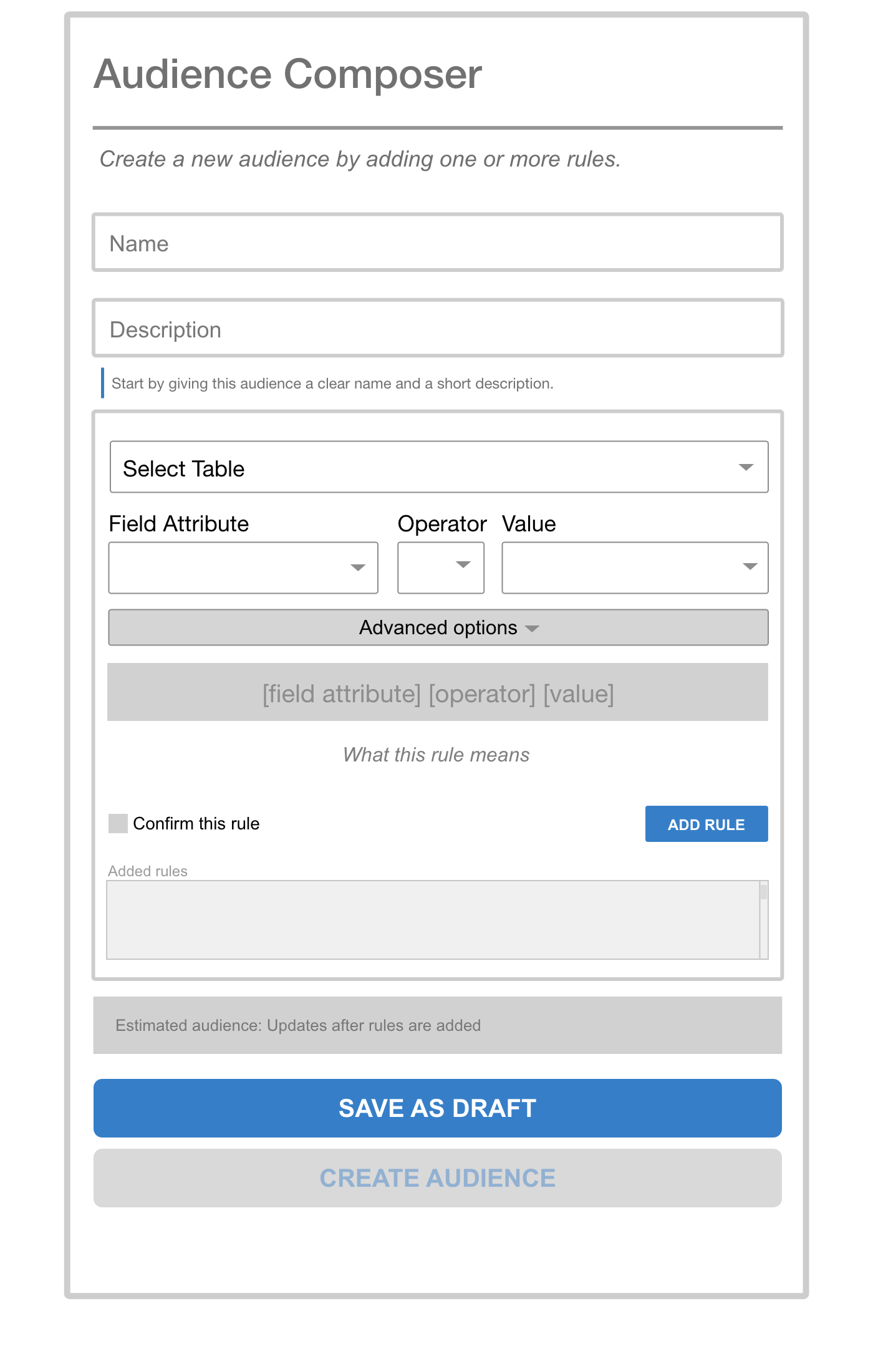
Clear entry point. Name and describe the audience before building rules. CREATE AUDIENCE is disabled until at least one rule exists.
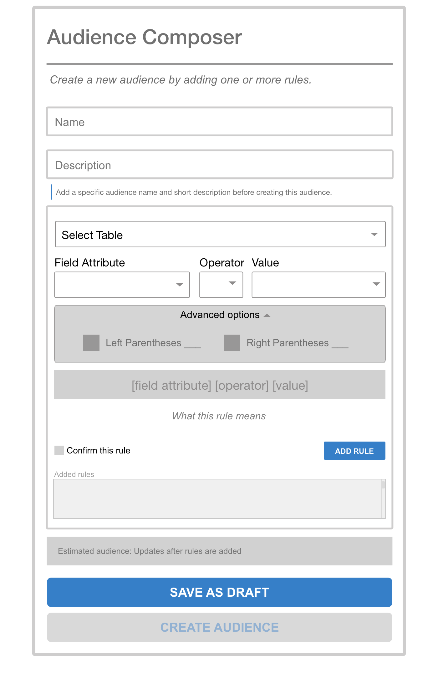
Parentheses grouping is hidden by default. Power users can expand it; everyone else gets a clean default.
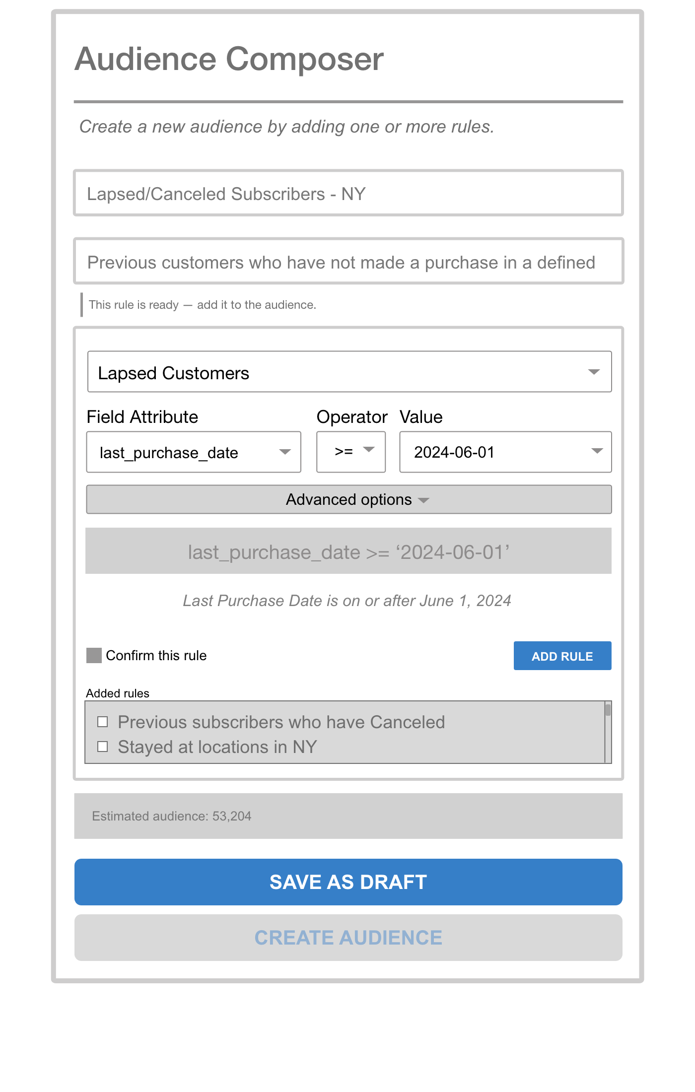
As selections are made, the API syntax and a plain-English translation both appear. "Confirm this rule" must be checked before ADD RULE activates.
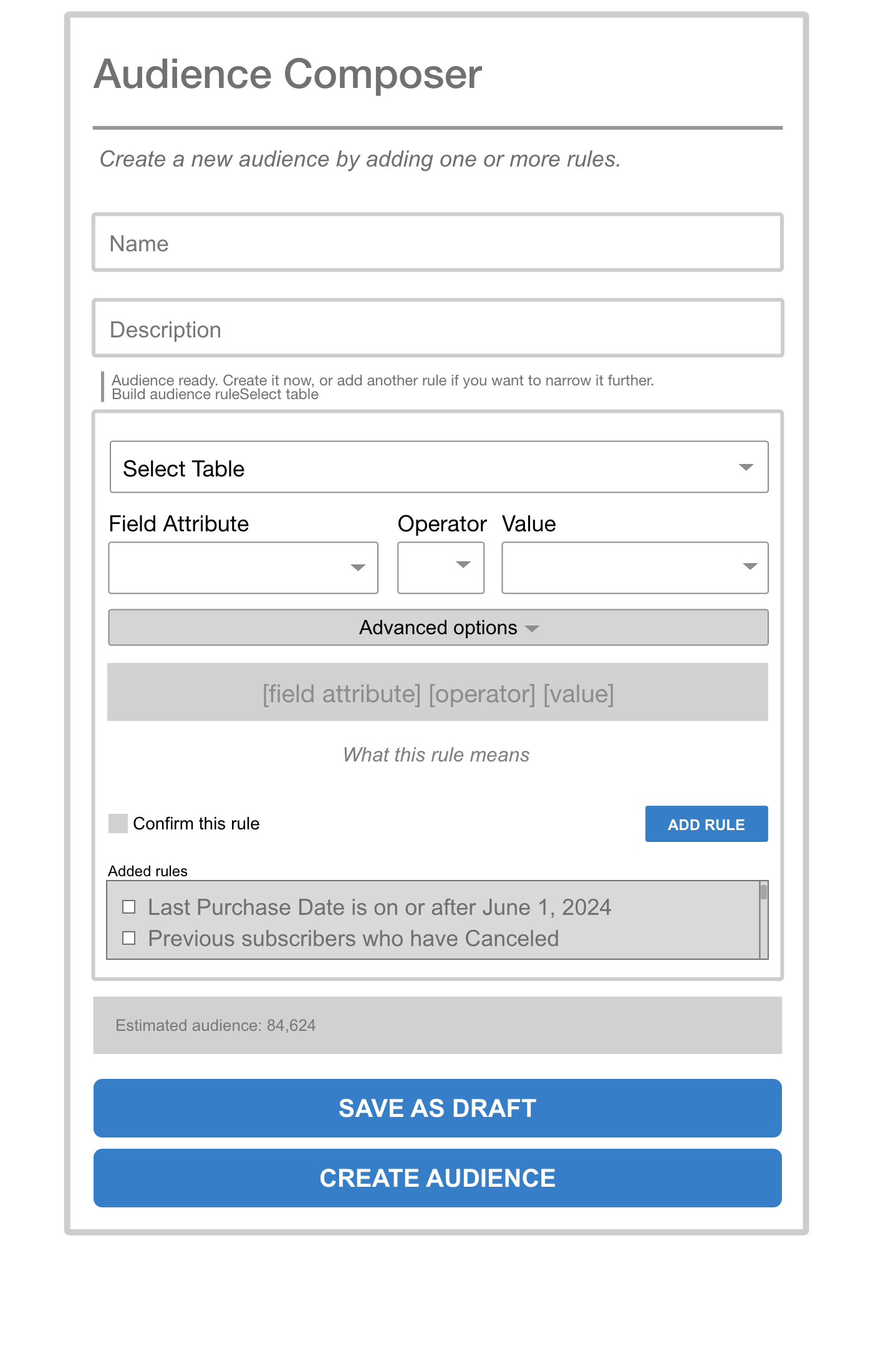
Confirmed rules appear in the Added Rules list using plain language — not API syntax. Estimated audience size updates automatically.
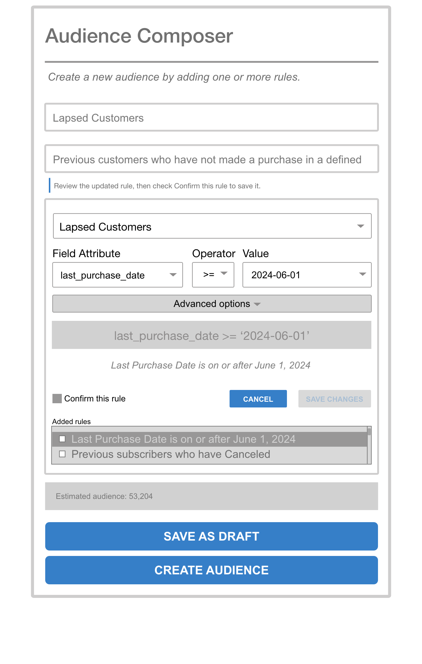
Selecting a rule surfaces EDIT RULE and DELETE RULE contextually. Editing loads the rule back into the builder with Cancel and Save Changes — no need to delete and recreate.
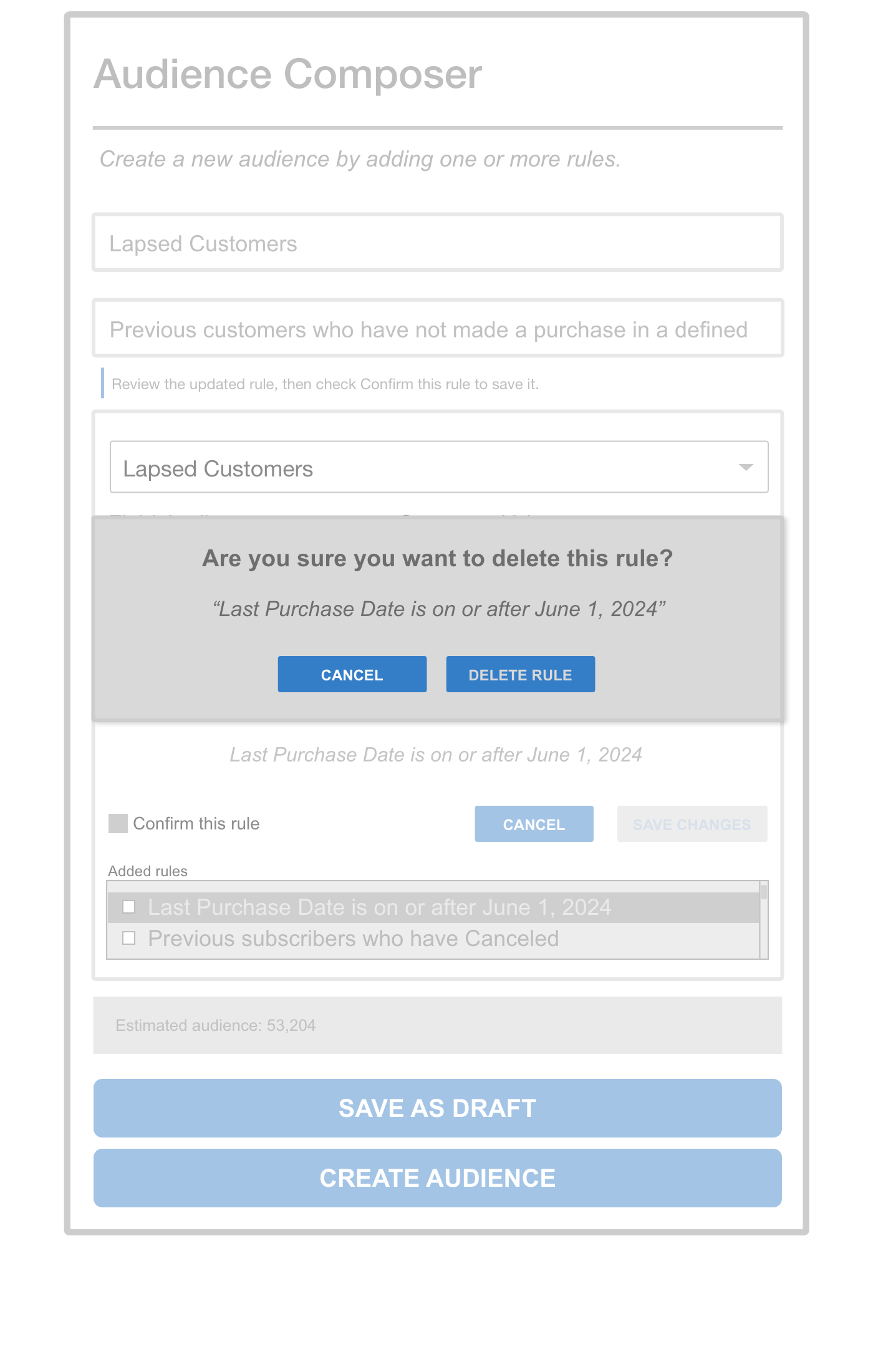
Deletion surfaces an inline confirmation that quotes the rule by name — making the consequence explicit before anything is removed.
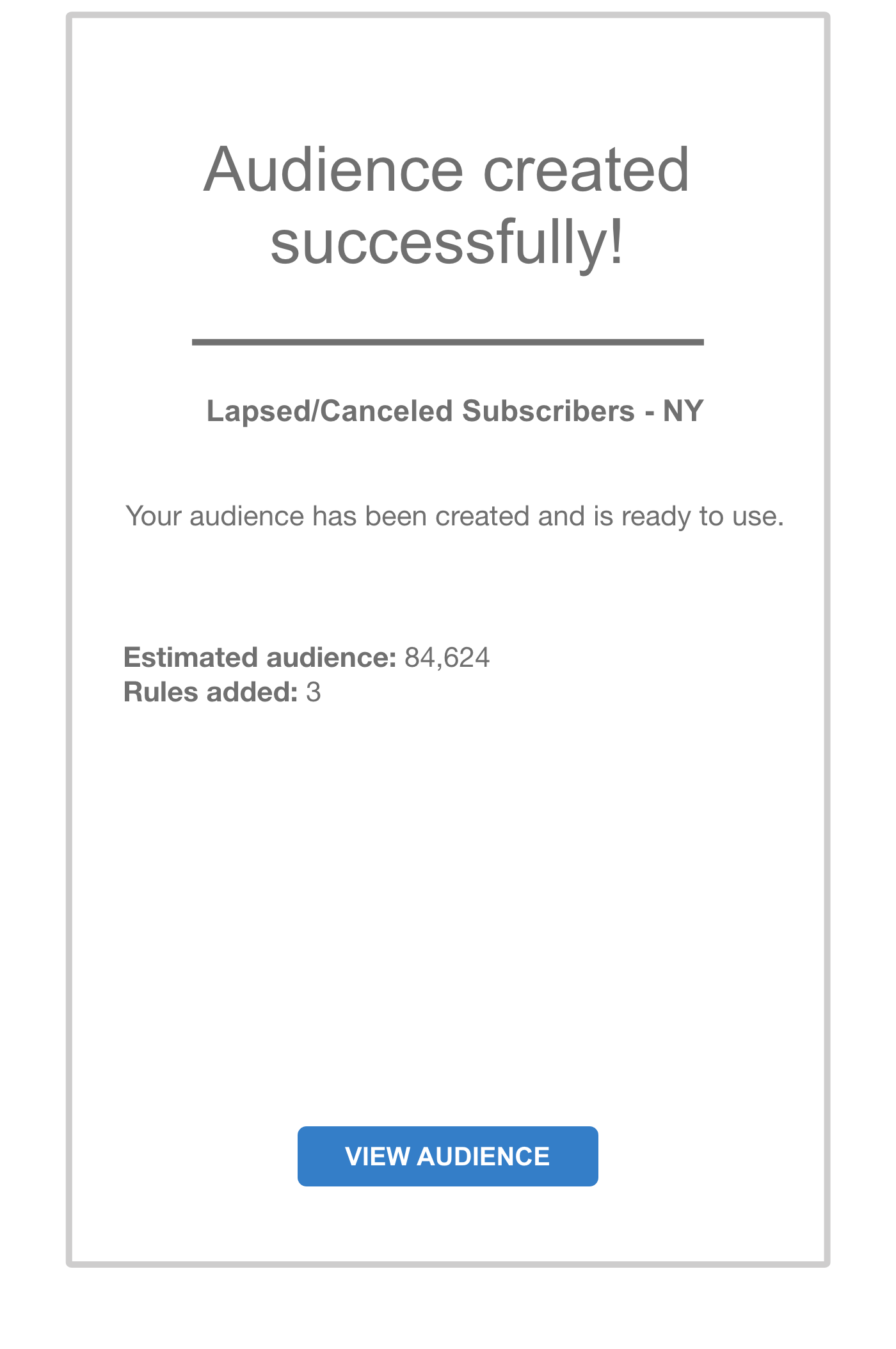
A dedicated confirmation screen closes the loop — audience name, estimated size, and rule count are confirmed. No ambiguity about whether it worked.
Outcomes
Note on status: This project was paused before stakeholder review and never reached usability testing—organizational changes ended it first. So the points below aren't measured results; they're what the redesign was built to solve, grounded in the discovery research that shaped it, plus how I'd validate it if it shipped.
What the redesign targets
- Reduce documentation dependency. Discovery showed users copying existing audiences because they couldn't read the rules. The plain-language translation is aimed at letting them build from scratch without a reference doc.
- Retire the "screenshot before saving" workaround. The confirmation step, inline editing, and delete modal exist to make that defensive habit unnecessary—a mistake becomes recoverable instead of catastrophic.
- Scale the pattern. The progressive-disclosure and validation model is designed to extend to other rule-based interfaces in the platform.
How I'd validate it
- Time to build an audience, before vs. after
- Reliance on external documentation
- Error and recovery rate on complex rules
- User confidence (task-based or short survey)
Reflection
The most valuable lesson from this project was that the users' workarounds were the real design brief. Screenshotting before saving, copying existing audiences instead of building new ones — both of those were signals that the system had failed to communicate something it already knew. The redesign's job was to surface that knowledge where users needed it, not hide it behind documentation.
Given more time and resources, I'd prioritize two things: first, formal usability testing with a broader set of users to validate the plain-language translations across the full operator set; second, exploring whether common audience templates could reduce the number of times users need to build from scratch at all.
Using AI to accelerate the MVP reinforced the value of clear UX documentation: the stronger the wireframes, rules, states, and interaction notes were, the better the prototype output became.