Lynchburg Garage Website Rebuild
Ecommerce website redesign focused on improving product discovery, usability, and conversion for a retail audience.
I led UX design and front-end development, aligning business goals with a clearer information architecture.
Retail website redesign focused on brand alignment, product clarity, and improved browsing efficiency.
Project Information
- Client :Lynchburg Garage
- Category :Web Design
- Role :UX & Web Designer
- Platform :Shopify/HTML/CSS
- Industry :Retail / Lifestyle
Overview
Lynchburg Garage is a retail brand whose website needed improved structure and usability to better support browsing and purchasing decisions.
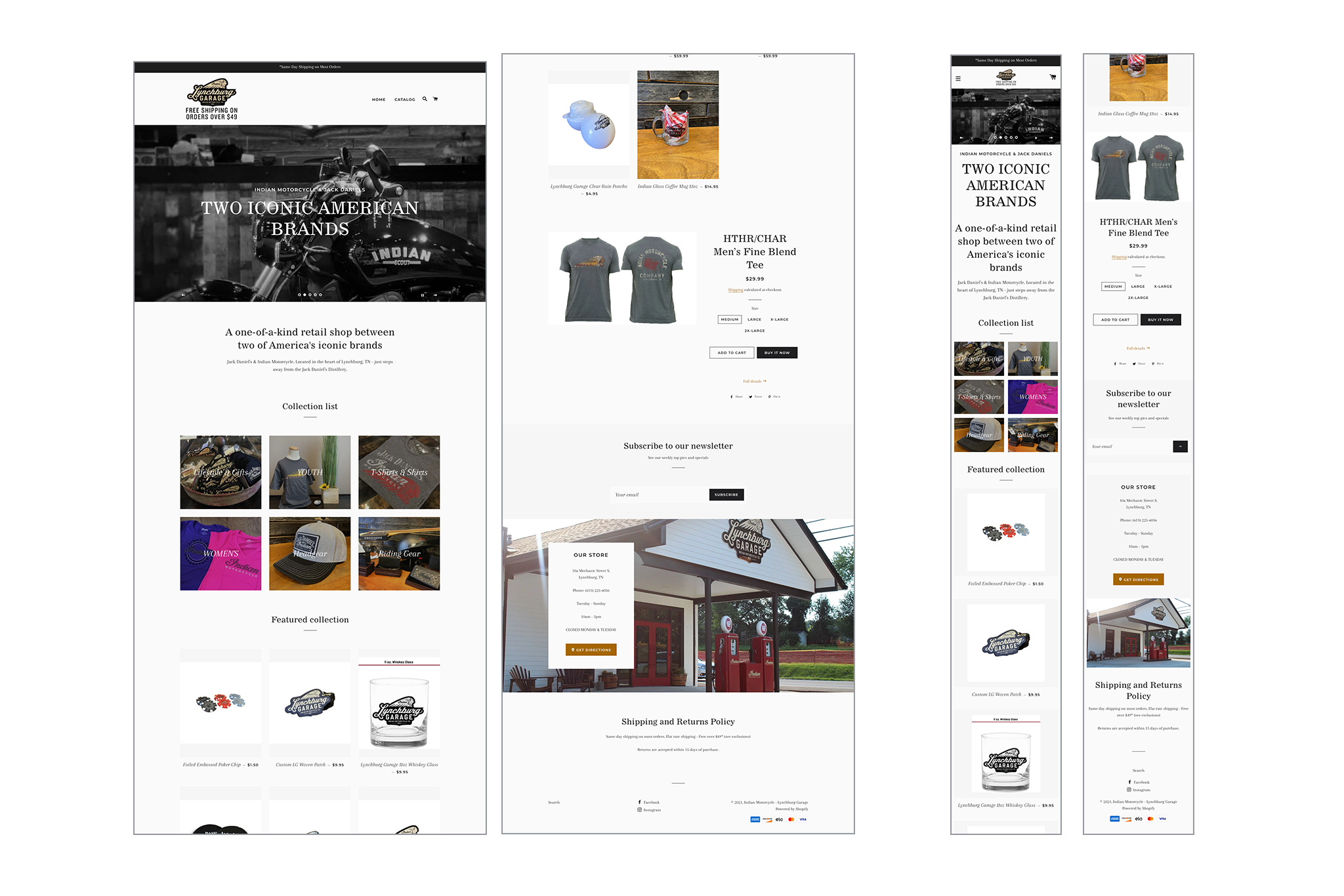
The existing website presented all products within a tall, vertically stacked layout, creating a tedious experience on both desktop and mobile. Featured products were often pushed below the fold, and the overall design lacked visual consistency with the parent Indian Motorcycle brand.
Problem
- Excessive hero height prevented products from appearing on first view
- Long vertical scrolling reduced product discoverability
- No clear product categorization
- Visual inconsistency with Indian Motorcycle and Jack Daniel’s branding
Original Layout
Solution
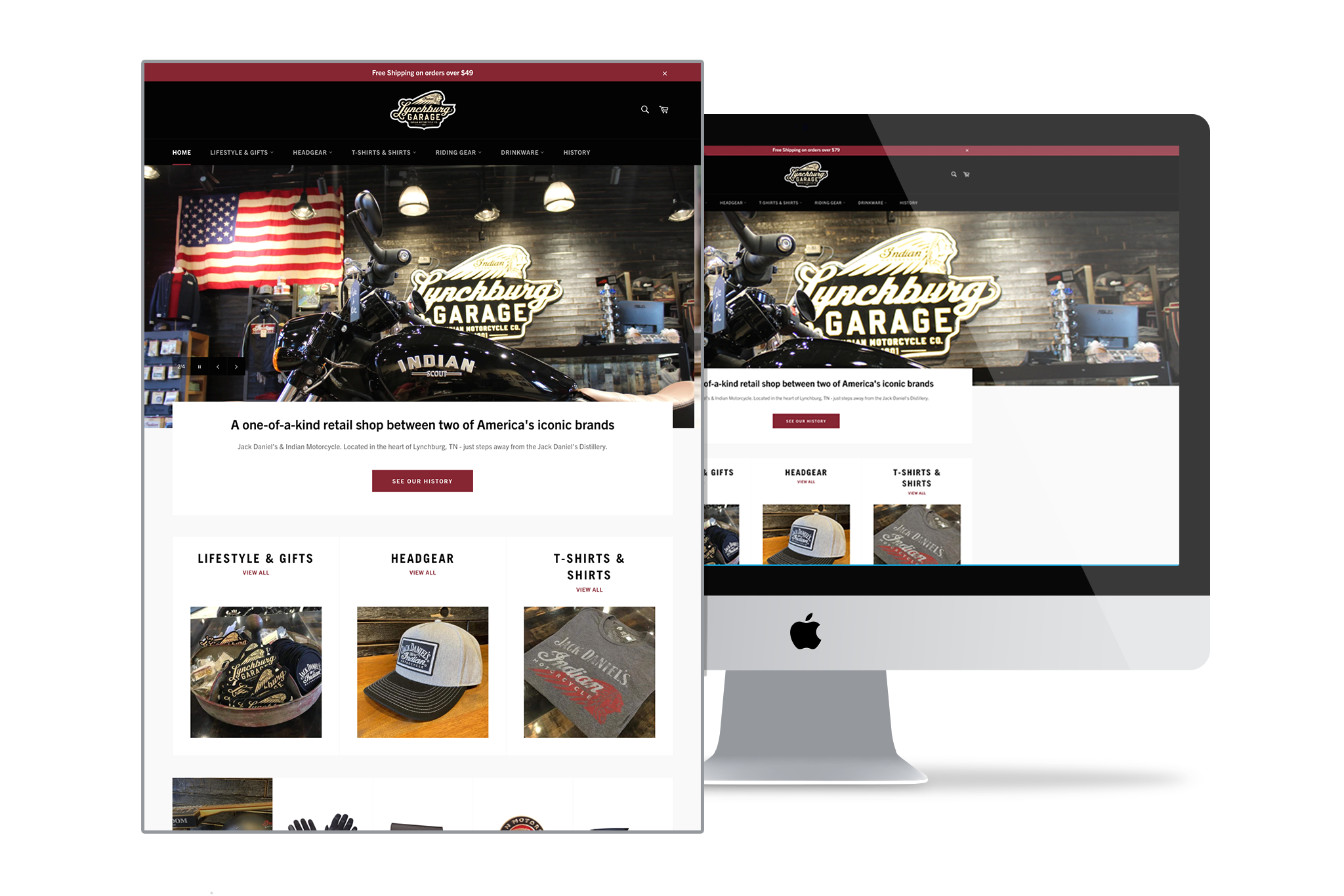
The redesigned experience focused on reducing vertical space, improving hierarchy, and introducing clear product categories. The hero was resized to prioritize product visibility, while navigation was streamlined to prevent an “everything on one page” experience.
Design Strategy
- Reduced hero height to surface products immediately
- Introduced sub-navigation to group merchandise by category
- Aligned typography, color, and layout with parent brand systems
- Designed for efficient scanning across desktop and mobile
Platform Considerations
The site was built on Shopify, requiring rapid onboarding into Shopify’s templating system and Liquid syntax. Design decisions were made with platform constraints in mind, balancing visual consistency, performance, and maintainability within an e-commerce framework.
Solution
The visual language was refined to reflect the shared heritage of Indian Motorcycle and Jack Daniel’s. This included darker tones, strong typography, and structured layouts that emphasized craftsmanship, authenticity, and American legacy.
Outcome
The final design delivered a more focused, brand-aligned retail experience that surfaced products earlier, reduced cognitive load, and created a clearer path for browsing across devices.
Results & Impact
- Streamlined product navigation and category structure
- Improved content hierarchy to support faster decision-making
- Enhanced usability across desktop and mobile devices
- Aligned visual design more closely with brand identity